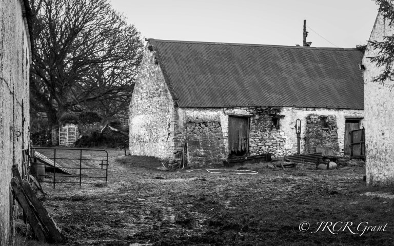
In looking out for scenes to match the ‘Abandoned’ photo challenge theme for last week, I came across this old farmyard near the ruin of Ballyannan Castle. While it did not fit the theme perfectly I thought it worth taking a shot for a later post. So, here it is, an old Cork farmyard.

While I liked the old farm buildings in particular, I found that the bare tree added somewhat to the scene. I took the original shot in colour, but felt that it would be much more effective in black and white. Here’s the colour version, for comparison.

Thankyou for the photos of both the castle and farmhouse.
This is the home my father grew up in..and the yard we played in as children..and it really is an abandoned place..on many levels
LikeLiked by 1 person
Angelina, you are more than welcome and I am so glad that you managed to find them. As is my want, I just took off down a boreen wondering what I might find. Abandoned it may be but it still has a haunting beauty and I bet you have many a memory. Do you still have family there? MM / John 🍀
LikeLike
I like it in colour too, but you were right to make a b&w version. It brings out the old atmosphere. Love the composition with the tree.
LikeLike
Thank you Inga, nice to hear that your thinking was along my lines too. MM 🍀
LikeLike
Yes, it definitely looks more abandoned in B&W. 🙂
LikeLike
Thank you, will be popping over later to take a look at your own blog – dog needs walking now. 😃
LikeLike
Definitely B&W is far more effective. Great shot.
LikeLike
Thank you Suz, MM 🍀
LikeLike
I can’t tell if I prefer it in colour or b&w. Lovely photo in either case, however.
LikeLike
Thank you, MM 🍀
LikeLike
Black and white definitely gives a better feel. Well done!
LikeLike
Thank you for taking the time to comment, I fully agree.
LikeLike
MM – you have such a good eye!
LikeLike
Thank you Theresa, so pleasing to hear you think so. MM 🍀
LikeLike
Great work! (in b&w) 🙂
LikeLike
Thank you iosatel, appreciate the feedback, MM 🍀
LikeLike
B&W is striking and harsh almost; color seems to soften the picture. I like both…
LikeLike
Thank you, losing the red is the worst thing in moving to colour, but I think the stark atmosphere goes best with B/W as you allude to above. MM 🍀
LikeLike
I prefer the b&w one. 🙂
I wish you a wonderful Tuesday.
(BGH)
LikeLike
Likewise – sun is shining here 🌞
LikeLike
It’s shining here too. 🙂
LikeLike
👍 (thumb up)
LikeLike
Love the Black & White version, MM.
I think you could have used it as “Abandoned” as it looks a bit that way, if only for the muddiness of the yard.
LikeLike
have to agree it is close to abandoned, particularly given the mood projected by the bare tree. However, as it is very much still in use I simply used those structures that really were abandoned – we’re spoilt for choice in that area. MM
LikeLike
oh well done. Black and white really accentuates the abandonment!
LikeLike
black and white is more effective!
LikeLike
Agreed and thank you for commenting. Have a good week. MM 💚
LikeLike
have a good week too ❤
LikeLike
All agreed then, MM 👍
LikeLike