So here we are on week four of the One Four Challenge hosted by the gracious Robyn G. To date my daffodil image has undergone a number of subtle changes as the weeks have gone by.
This time I have made a big jump by combining the original image with two further images that were subsequently taken (possibly of the same flower just by the front door). All of the images had sprinklings of natural droplets on them – no need to use the water spray over here.
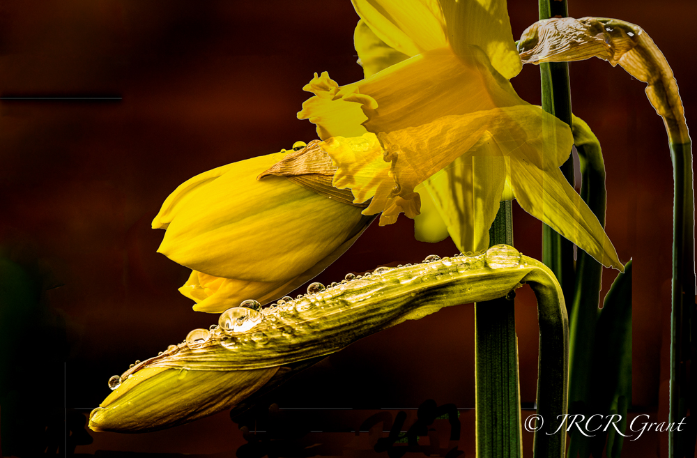
I was debating whether to show this or not as I am not fully happy with it and feel it needs more work, perhaps a different approach. Be delighted to receive feedback from all of you out there.
Above all thanks again to Robyn G for acting as a brilliant host.
MM 🍀

Its truly lovely John and I hope you do have another go at it 😃
I am doing fine thankyou.. Plodding along after a couple of very busy weeks!
Trust things are well with you and yours too.
LikeLike
The late host checking in John 😃
When I first saw this image, I loved it and I still do!! It has stayed in my thoughts. Thats always a good sign.
The clarity and detail are stunningly beautiful and the concept is a great one!
A thought I had about representing the 3 stages would be to have them going from full colour to b&w? ..or something similar.
Has a crisp botanical feel to it. I love it! 😃😃
LikeLiked by 1 person
Thank you so much for your thoughts and praise Robyn. It certainly gives me food for thought. Might just go back and have a good play with it. Hope all is good with yourself Robyn. MM 🍀
LikeLiked by 1 person
I like the idea and the fact that it might be the same flower. My favorite so far. The only thing I would change is transparency on the biggest daffodil.
LikeLike
My first reaction when I saw your image was “3 stages of growth, how brilliant an idea”. It does make it a busy image, and the drops on the bud are very prominent compared with the other daffodils. I wonder whether you make the big daff less transparent so it does not show the outline of the middle bud through its petals…. Anyway John, I think you’ve done a fantastic job! I love the colours, the warmth of the background… Hey, if you really want to do more work, may be that’s the ideal April project!
LikeLiked by 1 person
May be you’re right, it could be a project for April. I did try reducing opacity on the large daff but was not pleased with the result at all. Thanks for your input as ever, John 🍀
LikeLiked by 1 person
I agree with Emilio, perhaps more subtle transparency with the layers and some more separation of the flowers? but I really like the concept you were going for and the rich colours in this version are lovely 🙂
LikeLiked by 1 person
Thank you Lens Addiction. I too liked the rich colours, including the background. Will have to play around with the layers, opacity and blending modes – something which I am only just learning. Glad you liked the concept anyway, even if it was not fully pulled off. Once again thank you for your comments as they are appreciated. MM 🍀
LikeLike
Layers and blend modes are fun 😊
LikeLiked by 1 person
It’s a challenge just working out which each one does, let alone which one you should use for the effect that is in your head. 😦
LikeLike
Yup, there is a book that does specifically address blend modes. I dont have it but I have seen it.
LikeLiked by 1 person
At first I loved the image. Then you mentioned that you were unhappy and looking for feedback. So I took a second look and, perhaps the overlapping of the successive layers is too much? Maybe try re-positioning them with a bit of space, if you can. I still like this version the best, though.
LikeLiked by 1 person
Thank you Emilio. I have to confess that having them separated completely was not the effect I was looking for as I wanted the flowers to represent its evolution, rather than be distinctly separate. However, perhaps you are right in that it would be the most pleasing way to show the three shots.
LikeLiked by 1 person
Well, I would say just a slight overlap. But I prefer your thinking behind their positioning! Did I say I still love the image? 🙂
LikeLiked by 1 person
Thank you Emilio the Gent. 👍
LikeLike
I like this togetherness, and the composition growing to the upper right! And it has a dreamy effect with the slightly transparent daffodil. If I HAD to change anything, I would have put them even closer together, so that the stem to the right kind of falls in to the other stems. Or rather – back the others to the right, leaving a wee bit more space to the left.
Oh don’t mind me! Your photos are always stunning!
LikeLiked by 1 person
Ninna, suggestions are always welcome as I feel I have not nailed it, but at least you can see what was in my mind. 😀
LikeLike
Yes! I think I did, and I really loved that! It!
LikeLiked by 1 person
What if you created a layer mask, John and painted out some of the layers below (losing the transparency of the blended layers underneath the full-blossomed flower)? I think it wouldn’t have that “a little too busy” look then.
LikeLiked by 1 person
I love the yellow against the rusty background colour, truly makes the flowers pop. Feels just a tad busy for me but still beautiful.
LikeLiked by 1 person
I agree with you on the busy side. I don’t think I managed to achieve what I was striving for and there is no simple fix………
LikeLiked by 1 person
I still think it is a most valiant effort (and something I have no clue how to do!!)
LikeLiked by 1 person
Thanks Dale, learning all the time over here…
LikeLiked by 1 person
We must never stop learning!
LikeLiked by 1 person
John I really like it and how it shows that bottom bud with the lines accentuated and the rain drops… I wonder whether its the crop that’s giving you that not quite there feeling… Maybe play around with cropping it differently or a bit more and it might pop for you??? 🙂
LikeLiked by 1 person
Thanks for the suggestions, probably need a bit more time to play around with it – there are three separate images at work here so plenty going on, what with the blending, positioning, background……..🍀
LikeLiked by 1 person