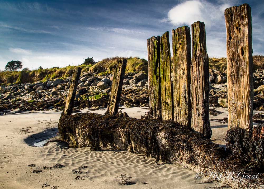
So here we are in week 2 of the One Four Challenge and I am simply adding the colour back in, having gone for the black and white version in Week 1.
Why not have a go at the One Four Challenge itself, it is so easy to try and will really help to develop processing skills. Of course you could simply just have a tour of Robyn’ fine site anyway.
Now to start thinking on the process for week 3.

Love the color and texture.
LikeLike
Such a great image to work on, it looks beautiful in this colored version.
LikeLike
All these challenges!!!! I can hardly keep up with WP:s Weekly Photo Challenge! 😦
Wonderful picture! Got to search in my map with summer pictures.
LikeLiked by 1 person
At the moment I am only taking part in the One Four Challenge – it just requires one photo a month and then lots of different edits 😎
LikeLike
Editing is fun! Really fun! Love doing that. I always edit the pictures I publish! (almost every picture)
I only join WPC, and try to post at least one photo a week, sometimes two. If I publish more, I consider it a bonus. And is not necessarily related to WPC
LikeLike
This is such an appealing image john. Id love to be standing there. The textural detail and vibrance are wonderful and I do like that sky.
We really are learning new things along the way with this challenge – love that 😃
LikeLiked by 1 person
As generous as ever Robyn, thank you so much, MM
LikeLiked by 1 person
Great image and composition. I like the HDR look mentioned by others… the sky is dramatic too.
LikeLiked by 1 person
One reader felt that the clouds took away from the image in the b/w, but I personally love them. The tree on the far left is an important piece of the composition IMHO. Thank you for taking the time to comment Karen, really appreciated. MM 🍀
LikeLiked by 1 person
Hi John, I think I am with Ben on this one. This colour image brings out the textures more and does have an HDR look about it.. Nice shot 🙂
LikeLiked by 1 person
Cheers Kaz, we all seem to be singing with the one voice……..🍀
LikeLike
I think I like the colour more than last weeks. Has a slightly HDR feel with the contrast and texture esp in the sentries. Very nice.
LikeLiked by 1 person
Thanks Ben. It is partly why I started the series with the B/w version. This packs more punch IMO. Cheers, John
LikeLiked by 1 person
yep differently has more punch to it.
LikeLiked by 1 person
I love the angles in this image John! It works beautifully in both monochrome and colour 🙂
LikeLiked by 1 person
Thank you very much Sarah. It was a difficult one to get a good angle on due to people and signs etc
LikeLiked by 1 person
Oh that’s a problem I know so well!!! You really did catch it perfectly. Forgot to mention the ripples and patterns in the sand! So much fun texture 🙂
LikeLiked by 1 person
I like this composition, beautiful sky, good work 🙂
LikeLike
I like this, Mick….love the textures here
LikeLiked by 1 person
So kind Sue, thank you for your comments, MM 🍀
LikeLiked by 1 person
Wow. Love this one too. You are going to make it difficult for us to choose again, aren’t you? 😉
LikeLiked by 1 person
Plenty more work to do to get this looking good…..😈
LikeLiked by 1 person
Brilliant!
LikeLiked by 1 person
Cheers there Rajiv, have a great week, MM 🍀
LikeLike
Hi MM, I quite like the saturation in this version. Looks like you brought all the colours back in one hit! Looking forward to the next edit!
LikeLiked by 1 person
Cheers, more l;likely to have used a touch of vibrance than saturation, which I tend to avoid. I did select blue and reduce its luminescence, getting the darker sky. MM 🍀
LikeLiked by 1 person