A new month a new One Four Challenge. I have selected a landscape image taken yesterday while out for a walk with the dog.
Rather than start with a fairly standard image with a few tweaks, I thought I would commence with a black and white version. Next week the colours will be introduced back into the picture.
To see more of the One Four Challenge and see how you can get involved, you can visit the excellent Robyn G, or go direct to the One Four Challenge spot on her Blog.
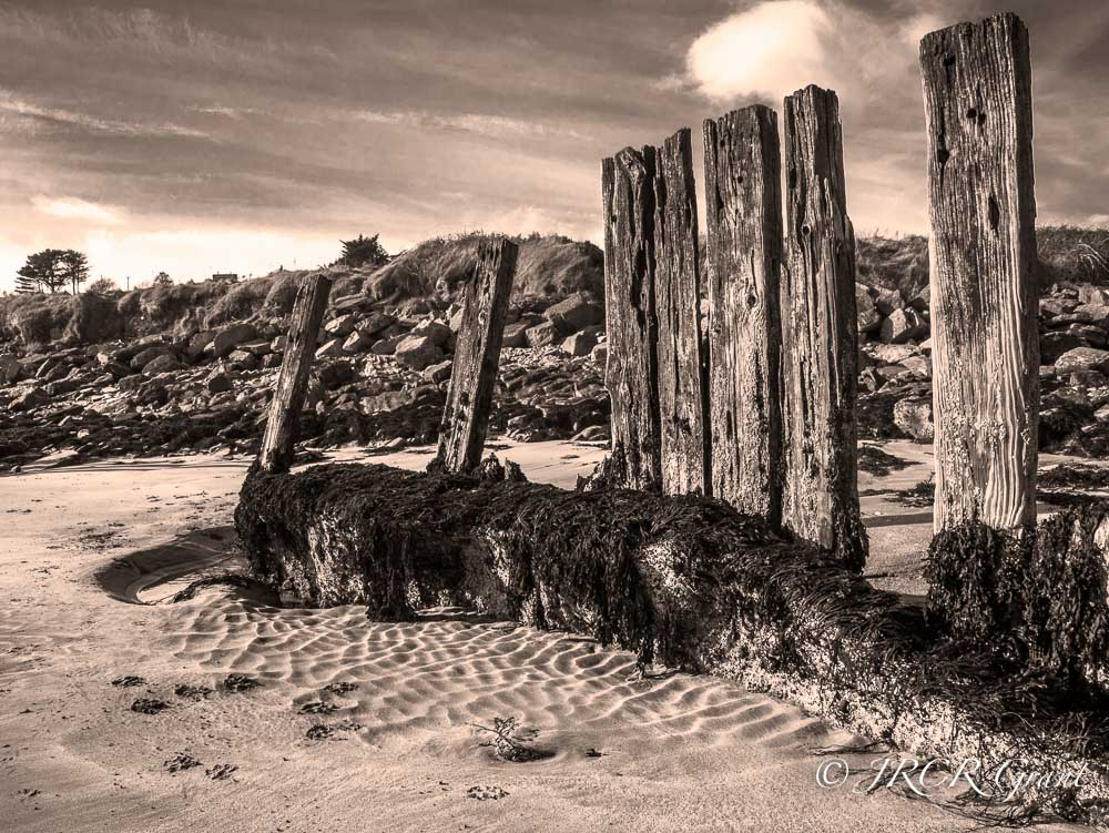
For those interested, the beach is Harbour View beach and it nestles just below Kilbrittain in West Cork, Ireland.

Nice
LikeLiked by 1 person
Thank you Serial, greatly appreciated
LikeLike
It’s going to be hard to choose on these. I love the sepia treatment and the sky!
LikeLiked by 1 person
Surely I should be trying to make it difficult (but interesting) for you all 😎
LikeLike
I really like this edit! It’s so moody. I do find the bright cloud a little distracting but I like the rest of the sky. 🙂
LikeLiked by 1 person
I like the ultimate effect of this and note your cloud comment chimes in with another comment left on here. Personally I quite liked the cotton wool ball on the top of the posts, but I can see your point. Thanks for commenting, greatly appreciated. MM 🍀
LikeLiked by 1 person
Lovely, all the textures standing out.
LikeLike
A multitude of them all in one shot. 👍
LikeLiked by 1 person
Love this in sepia. Looking forward to seeing the next three images!
LikeLiked by 1 person
I actually made this into b/w and then put on a warming filter to gain this effect…😎
LikeLiked by 1 person
Well I love the result… good job, sir!
LikeLike
Those sentries are striking! And the ripples in the sand so clear. The sky, too, is dramatic and lovely I do find the bright cloud over the sentries to be distracting, but all in all – great shot and editing!
LikeLiked by 1 person
Thanks for the response. I too like the ripples in the sand. What I would have preferred would be for the bank to be lower and the sky to have filled more of the image, but with the sentries still in the same position. May even try this in photoshop in an extreme edit. MM 🍀
LikeLike
classic look 🙂
LikeLike
Cheers Joshi, really looking forward to next week’s edition. MM 😎
LikeLike
So much texture with the lovely sand ripples, and the aged wood and the rocks, its all going on and this sepia process was a fabulous choice 🙂
LikeLiked by 1 person
Cheers Lens, I really just tried playing around with the sliders to get a b/w version that I liked and deciding it was too cold, warmed it up a bit with a warming filter in PS. 🍀
LikeLike
Really nice John 🙂
LikeLiked by 1 person
Cheers Kaz, plenty of texture for you all..😎
LikeLiked by 1 person
love the detail and sepia treatment!!
LikeLiked by 1 person
Initially it was the sand shadows, then the gnarled wood…..Glad you like it. MM 🍀
LikeLiked by 1 person
Hi MM – the sepia tone adds to the image forlorn feel with its old palings. Looking forward to the next interpretations!
LikeLike
Glad you are enjoying it. I have so much to learn and so much to lay with……
LikeLike
Simply said.. A very striking photo.
Really Like this week’s mono and looking forward the next editions as well 😃
LikeLiked by 1 person
As kind as ever 🍀
LikeLiked by 1 person
😃😃 Inspiring as ever 😜
Thanks.
LikeLiked by 1 person
Fantastic, really like the picture and the sepia edit is a great choice.
LikeLiked by 1 person
Thank you Ben. I used Lightroom to adopt a B/W approach by changing the individual colour sliders. I then went into PS to get rid of a sign that I could not get out of the picture. Still in PS I introduced a warming filter and that is what has given it a “sepia effect’. Perhaps I just chose the long way round, MM 😰
LikeLike
It is not the path but the destination that is important. I possibly would have removed the sign in PS and then done all editing in Lightroom with the sepia added through split toning.
LikeLiked by 1 person
Thank you, I am very much learning every day….
LikeLike
Love this sepia version, and such an interesting concept to introduce colour back into your photo…
LikeLiked by 1 person
Thank you so much for the compliment. The colours were quite striking and I wanted to take a measured approach to this. So I thought it would be good to start off with a B/W and then bring in the colour. Hopefully I can pull it off. MM 🍀
LikeLike
Looking forward to hearing about how you do this. You have inspired me to try something like this in one of the future one four challenges.
LikeLike
Nice MM .. Love your work 🙂
LikeLiked by 1 person
Thank you Julie, I think if you look carefully there may be traces of the Hounds bounds! 🍀🐾🍀
LikeLiked by 1 person
I like the sepia tone, old photograph feel to this image. The sky in particular works well this way. I almost started with my mono image this week too, I really like the idea of introducing the color as the weeks progress. Looking forward to it.
LikeLiked by 1 person
I just thought it was the natural place to start with the b/w. Lots to do for next week 😎
LikeLiked by 1 person
I thought I recognised it, a good place for photo opportunities!
LikeLiked by 1 person
A great place to walk the dog too 🐺🐺
LikeLiked by 2 people